
Choosing the Perfect Living Room Color Scheme

The living room is a space where we spend most of our leisure time, whether it's catching up on a favorite show or entertaining guests. That's why choosing the right color scheme for the living room can have a significant impact on how we experience this space.
The color scheme can set the tone for the room and influence the mood and emotions of those spending time there. A carefully chosen color scheme can make a small room look more spacious, create a warm atmosphere, or add a touch of elegance.
It's essential to take into account factors such as lighting and furniture when choosing a color scheme to ensure that the colors complement each other and create the desired effect. A well-thought-out color scheme can transform a living room from an average space to a beautiful and inviting area that reflects your personality and style.
Understanding the basics of color
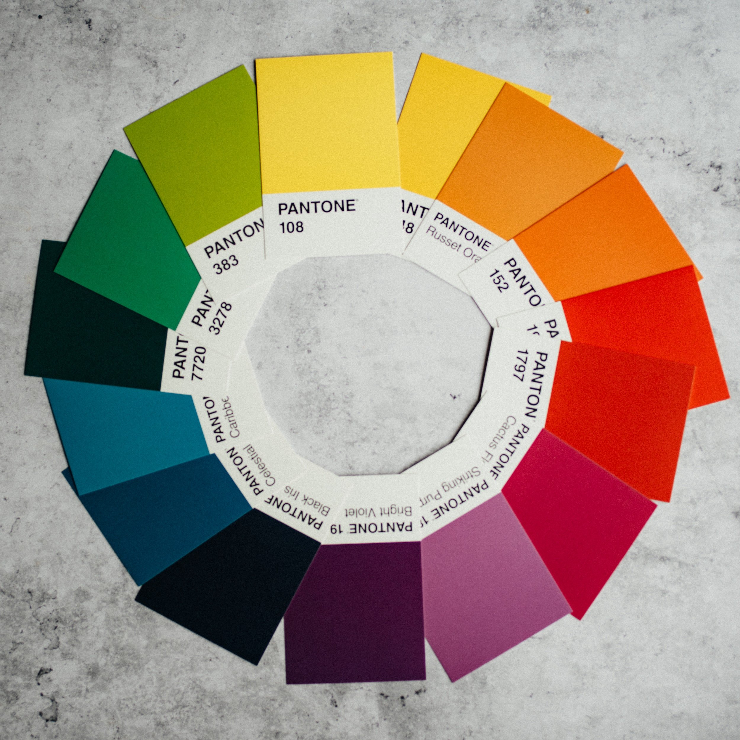
Explanation of the color wheel
Understanding the color wheel is essential for anyone interested in art, design, or fashion.
Colors are placed on the wheel in a specific order, forming a spectrum that helps us see how colors are related to each other. By using the color wheel, we can create harmonious color combinations or intentionally choose contrasting colors for a bold effect. Whether you're creating a painting, designing a room, or piecing together an outfit, understanding the color wheel is an invaluable asset.
It contains the primary colors, secondary colors, and tertiary colors.
Primary, secondary, and tertiary colors
Colors are more than just aesthetics. They have meaning, trigger emotion, and play a role in how people interact with their environment. Primary colors are red, yellow, and blue – the foundation of every other hue. Secondary colors are a mix of two primary colors from orange, green, and purple. Lastly, tertiary colors are a combination of one primary and one secondary color.
Knowing the basics of primary, secondary, and tertiary colors is essential in painting, printing, and design. They give life to illustrations, make objects visually appealing, and evoke emotions. By experimenting with different shades, you can create something amazing.
Warm and cool colors
Understanding the difference between warm and cool colors is important for artists, designers, and anyone who wants to create a certain mood or atmosphere in their work or environment.
Warm and cool colors are two different categories of colors that are found on opposite ends of the color wheel.
Warm colors include red, orange, and yellow. Additionally, warm colors are often associated with energy, passion, and warmth. In contrast, cool colors include blue, green, and violet, and they are associated with calmness, tranquility, and relaxation.
Complementary colors and color harmony
Complementary colors are colors that are opposite each other on the color wheel, such as red and green, blue and orange, and yellow and purple. The use of complementary colors in design creates a vibrant and visually appealing effect, and when used together, they create a strong contrast that catches the eye.
Color harmony, on the other hand, refers to the overall balance and pleasing combination of colors in a design.
A few popular color harmony methods include monochromatic, analogous, and triadic color schemes.

Use of cool colors, like blue.
Popular Living Room Color Schemes
Monochromatic color scheme
A monochromatic color scheme can make your living room the epitome of luxury and sophistication.
When choosing a monochromatic color scheme, you want to stick with just one color and use different shades and hues of that color throughout the room.
For example, if you choose blue, you can use navy, sky blue, baby blue, and teal in different elements of the design such as furniture, accessories, and even the walls. This creates a cohesive and harmonious feel to the room without it feeling too busy or overwhelming.
A monochromatic color scheme allows you to really play with the textures and patterns in your decor, adding depth and visual interest throughout the space. Plus, it's a timeless decorating choice that will always be in style.
Analogous color scheme
The analogous color scheme is a popular method of choosing color combinations in art and design.
This scheme involves selecting colors that are located next to each other on the color wheel.
These colors create a harmonious and cohesive look when paired together. An example of an analogous color scheme would be using shades of green, yellow-green, and yellow in a painting or design project.
One advantage of using this method is that it allows for a wide range of color choices while still maintaining a cohesive look. Additionally, analogous color schemes are easy on the eyes and create a sense of tranquility. Overall, the use of an analogous color scheme is a great option for those looking to create a visually appealing and harmonious color palette.
Complementary color scheme
A complementary color scheme is when two colors that sit opposite each other on the color wheel are used together to create an eye-catching contrast. For example, green and red or blue and orange.
One way to use a complementary color scheme effectively is to use one color as the dominant color and the other as an accent. This creates a sense of balance while still allowing the colors to stand out. Another benefit of using complementary colors is that they can evoke different emotions depending on how they are used. For example, blue and orange can be used to create a sense of playfulness or energy.
Triadic color scheme
A triadic color scheme uses three colors that are evenly spaced from each other on the color wheel.
This results in an energetic and vibrant palette that is perfect for creating a bold and eye-catching design.
The key to making a triadic color scheme work is to choose colors that complement each other and don't compete for attention. For example, you could use red, blue, and yellow or orange, green, and purple.
By using a triadic color scheme, you can create a design that is both visually stunning and harmonious.
Neutral color scheme
A neutral color scheme is a staple in the world of interior design.
It consists of colors that lack strong hues and tones, such as beige, gray, and white. These colors are often seen in combination with one another, creating a calming and sophisticated atmosphere.
Neutral colors are also known for their ability to adapt and compliment any style or decor, making them a highly versatile choice for any living space.
Their understated elegance can bring balance to a room that has bold colors or patterns, or be the main focus of a minimalistic design. Neutral color schemes provide a timeless appeal that never goes out of style, making them a popular choice for anyone looking to revamp their living space.

Neutral color scheme.
Factors to Consider When Choosing a Color Scheme
Room size and natural lighting
When it comes to choosing a color scheme for a room, the size of the space and the amount of natural lighting should be taken into consideration.
A small room with minimal natural lighting may benefit from lighter colors such as pastels or off-whites to make the space feel larger and brighter.
On the other hand, a larger room with plenty of natural light can handle bolder and darker colors for a cozy and intimate atmosphere.
It's also important to consider the purpose of the room and the mood you want to create. For example, a bedroom may benefit from calming colors to promote relaxation, while a home office may benefit from energizing colors to increase productivity.
Existing Furniture and Decor
Take time to examine the colors that already exist in your space and choose a color scheme that complements them.
If you have a neutral colored couch, for example, consider adding a pop of color with decorative pillows or curtains that coordinate with the existing decor.
Mood and atmosphere
When it comes to designing your living room, color is a crucial factor for setting the mood and atmosphere. Consider the feelings you want to evoke in your living room and choose your color scheme accordingly.
As previously stated, the colors you choose can affect the energy and ambiance of the space. Warm colors like red, orange, and yellow can create a cozy and inviting atmosphere, while cooler colors like blue and green can give a calming and relaxed vibe. More neutral colors like beige or gray allow for versatility in decor and can make the space feel larger.
Personal preference and style
When it comes to choosing the perfect color scheme for your living room, it's important to keep your personal preferences and style in mind.
Are you drawn to bold, bright colors or more subtle, neutral hues? Do you prefer traditional or modern decor?
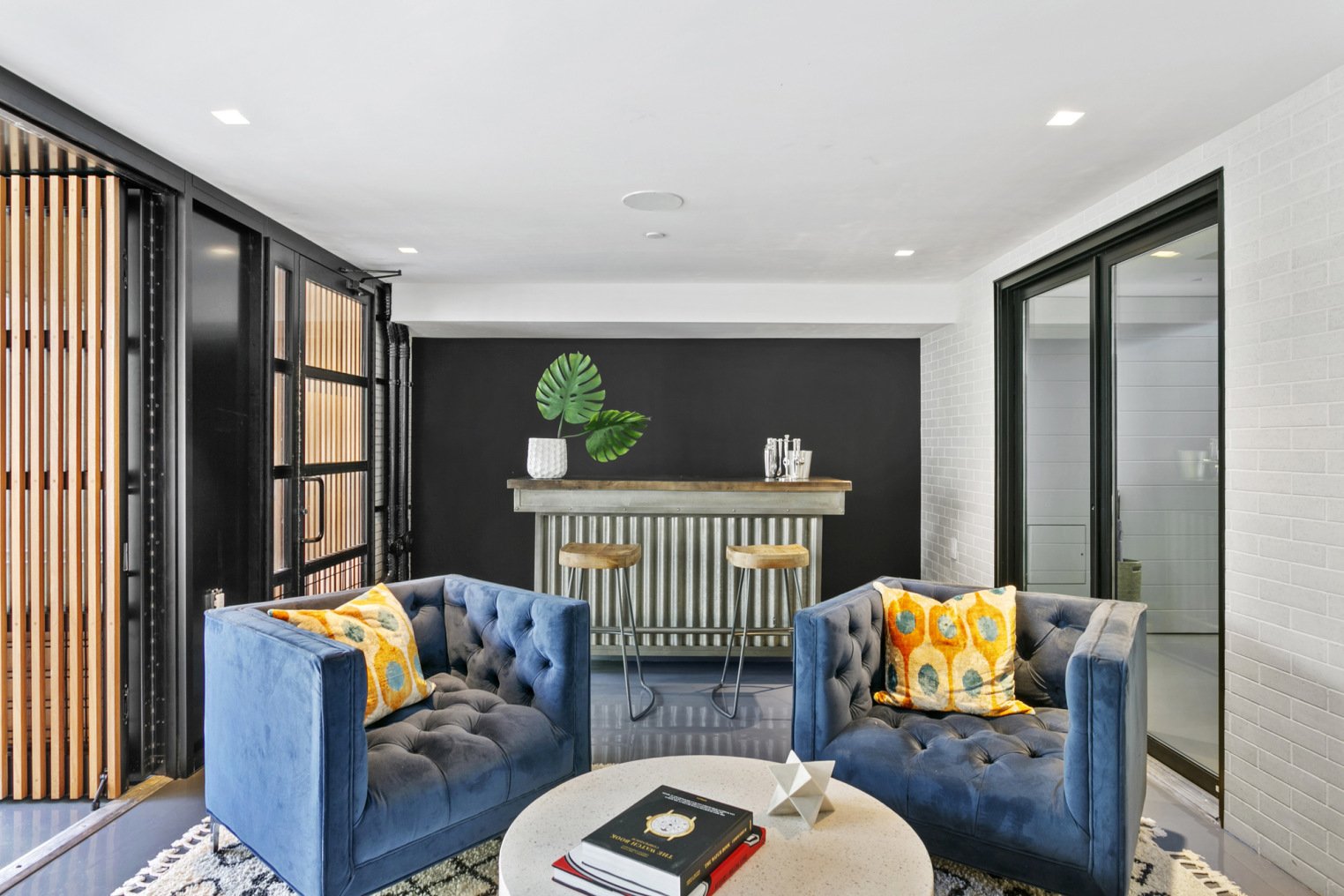
Complementary color scheme.
How to Test your Color Scheme
Create a Mood Board
How do you know if the colors you have in mind will work well together?
This is where a mood board comes in handy.
A mood board is essentially a visual representation of your design ideas, allowing you to experiment with different colors and textures before committing to a final look.
To create a mood board for your living room, start by gathering paint chips, fabric swatches, and images that inspire you. Lay them out on a board or piece of paper, playing with different combinations and arrangements.
Painting swatches on the wall
When it comes to redecorating your living space, choosing the right color scheme is one of the biggest decisions you'll make. After all, the colors you pick will define the look and feel of the room. If you're uncertain about the colors you want, consider painting swatches on the wall.
Swatches will give you a better idea of how different colors look under your home's lighting, and how they'll complement your furniture and decor. They're also a great way to compare multiple shades and see which one feels right for your space.

Tips for Implementing Your Color Scheme
Balancing colors and patterns
Choose a dominant color to anchor the room and build your scheme around it.
Then, add secondary colors in a variety of shades and tones to create depth.
When incorporating patterns, select designs with colors that complement your scheme rather than compete with it.
Utilize different scales of patterns to add interest while avoiding overwhelming the space.
Don't be afraid to mix and match patterns, but be sure to balance them with solid-colored accents and furniture to prevent the room from feeling chaotic.
Accentuating with textures and accessories
While color is a crucial element to this process, it’s the textures and accessories that can make your space truly shine.
Consider layering different textures, such as woven blankets, plush pillows, and various fabrics, to create a cozy and inviting atmosphere.
Accessories such as decorative vases, trays, and even wall art can also help to accentuate your chosen color scheme.
Aim to have at least three different textures represented in the space and vary the scale and proportion of your accessories for a balanced and visually appealing look.
Enhancing with lighting
When selecting lighting options, consider the type of lighting, color temperature, and intensity.
To create a warm and inviting ambiance, incorporate soft, warm white bulbs with a dimming option.
Use accent lighting to highlight specific features such as artwork or architectural elements.
Wall sconces and floor lamps can help give proper lighting to dark corners of your living room.
Don't be afraid to mix and match fixtures to create a layered effect and add depth to the room.